Ajwi yyc
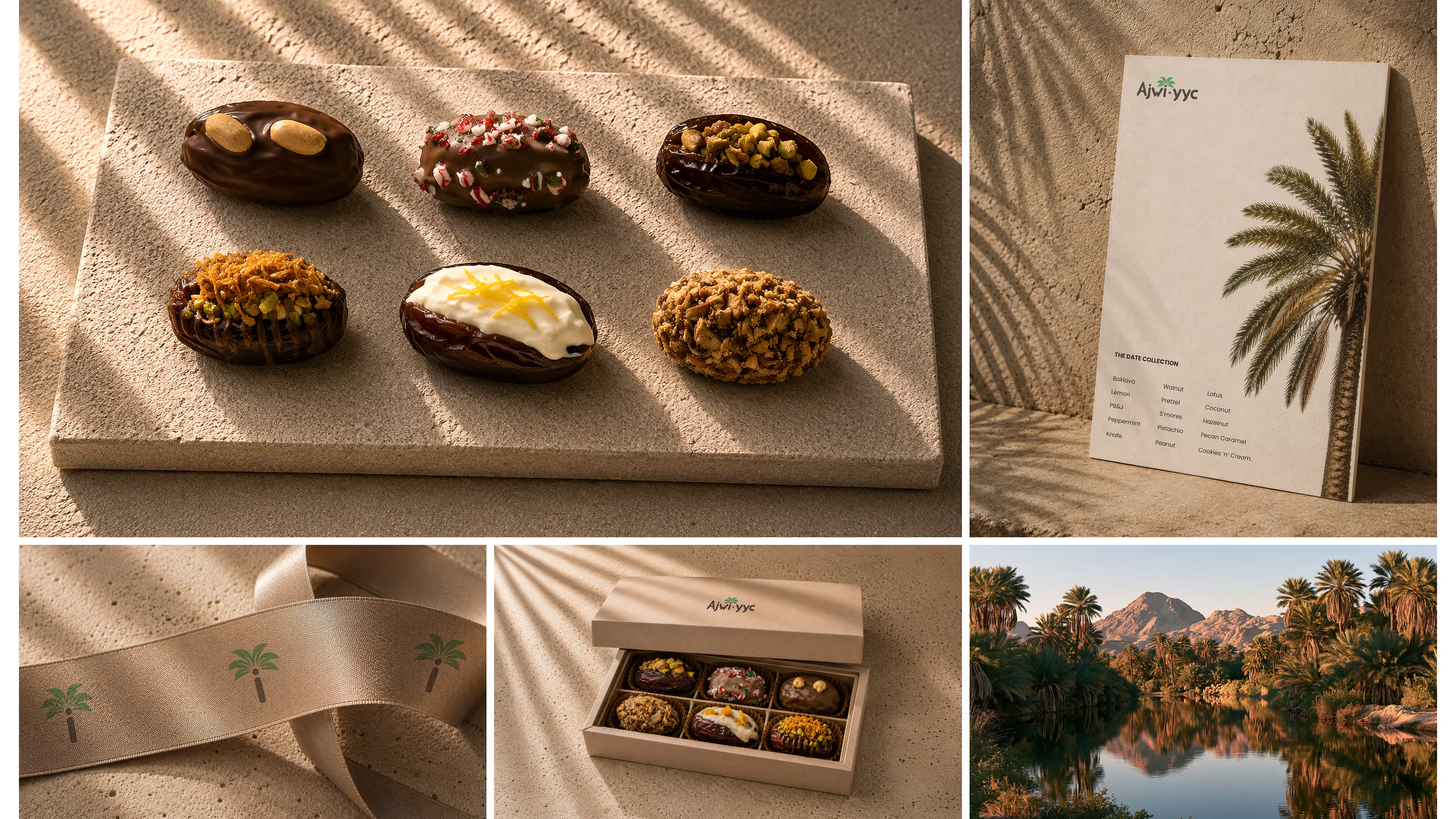
Ajwi YYC is a premium confectionery brand specializing in Medjool dates. Its identity system blends cultural influence with contemporary minimalism to create a cohesive visual language across packaging, photography, web design, and supporting brand assets.


Motion
A cinematic journey through sculpted stone, palm-shadowed architecture, flowing chocolate, and reflective water brings the Ajwi identity to life.
Color
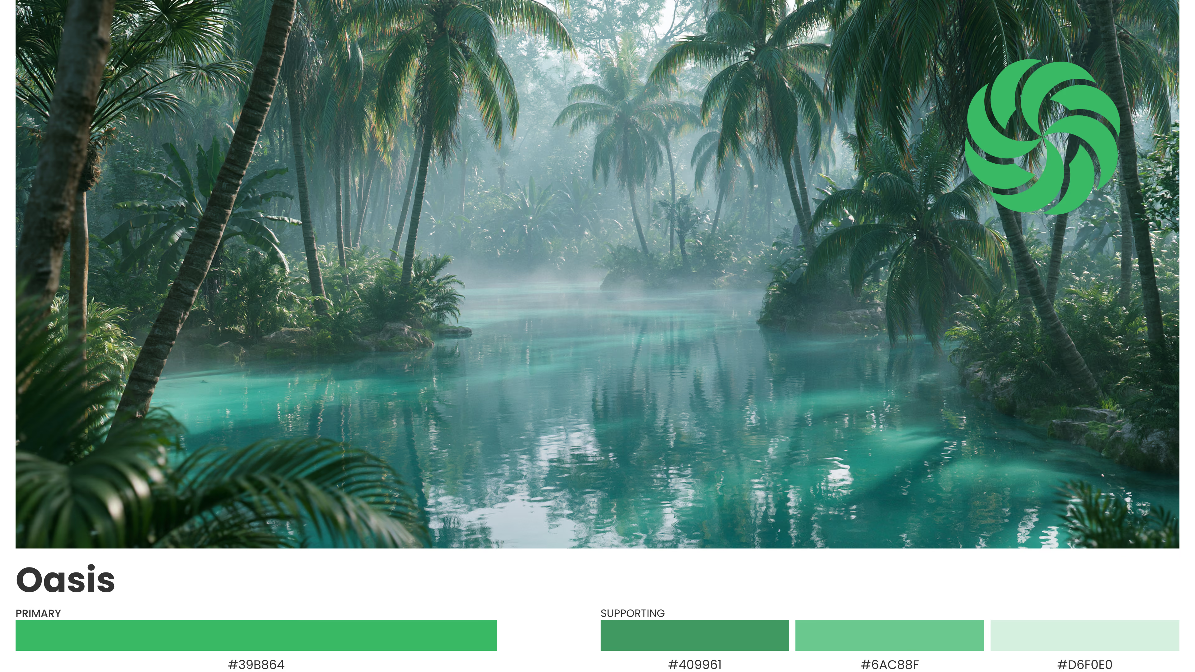
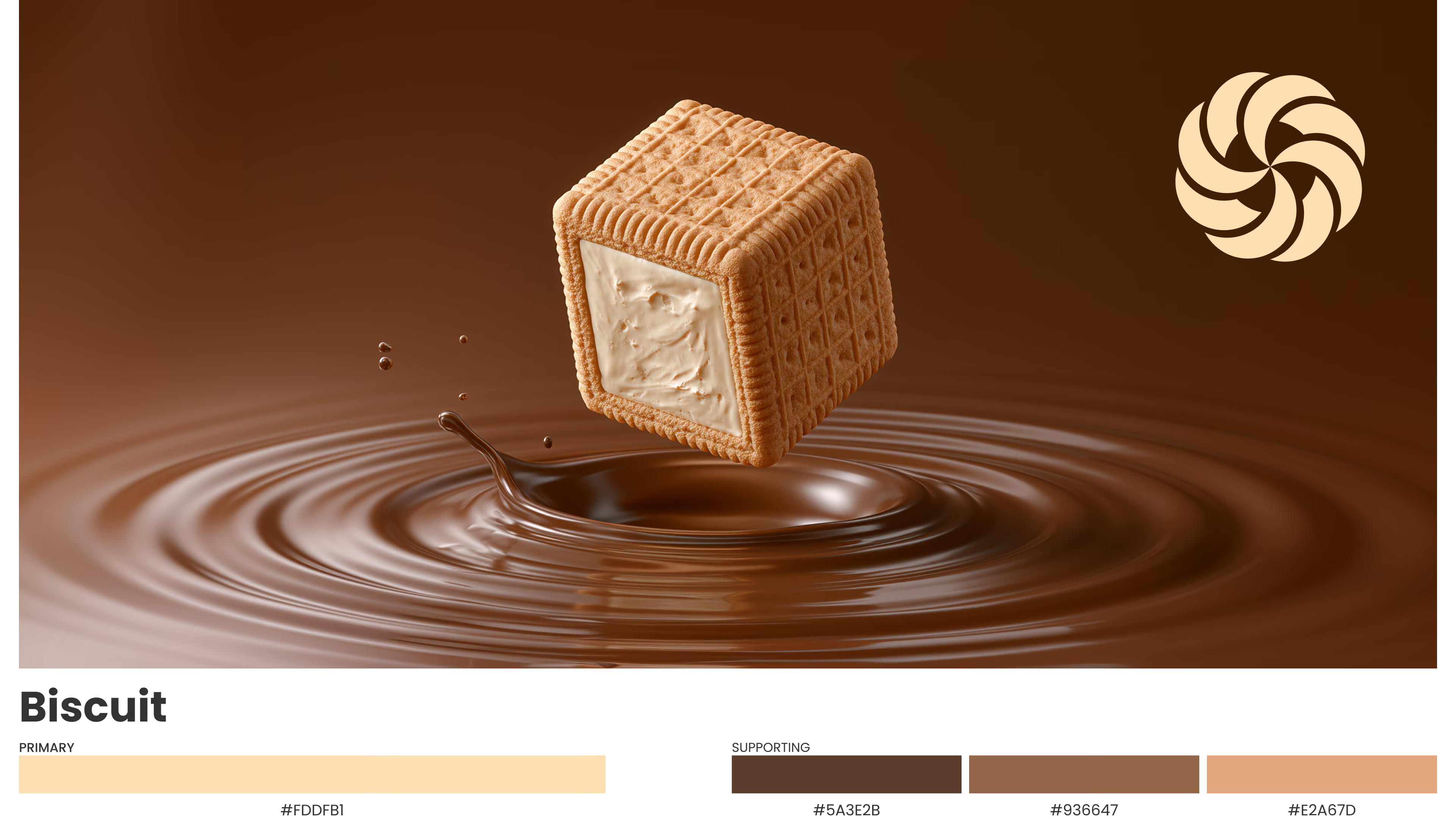
The palette draws from natural ingredients, using earth tones, warm neutrals, and restrained accents to reinforce flavor, quality, and recognition.
Typography
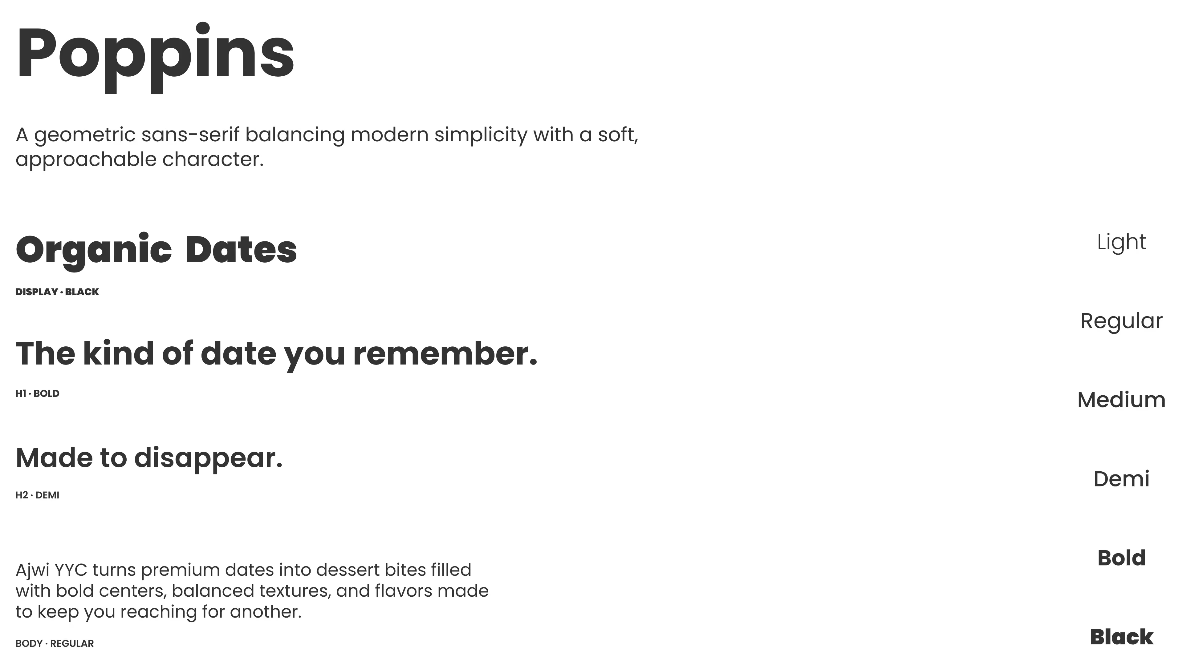
Poppins provides a warm geometric voice. A balanced type scale supports product storytelling, ecommerce experiences, and a refined brand presence.
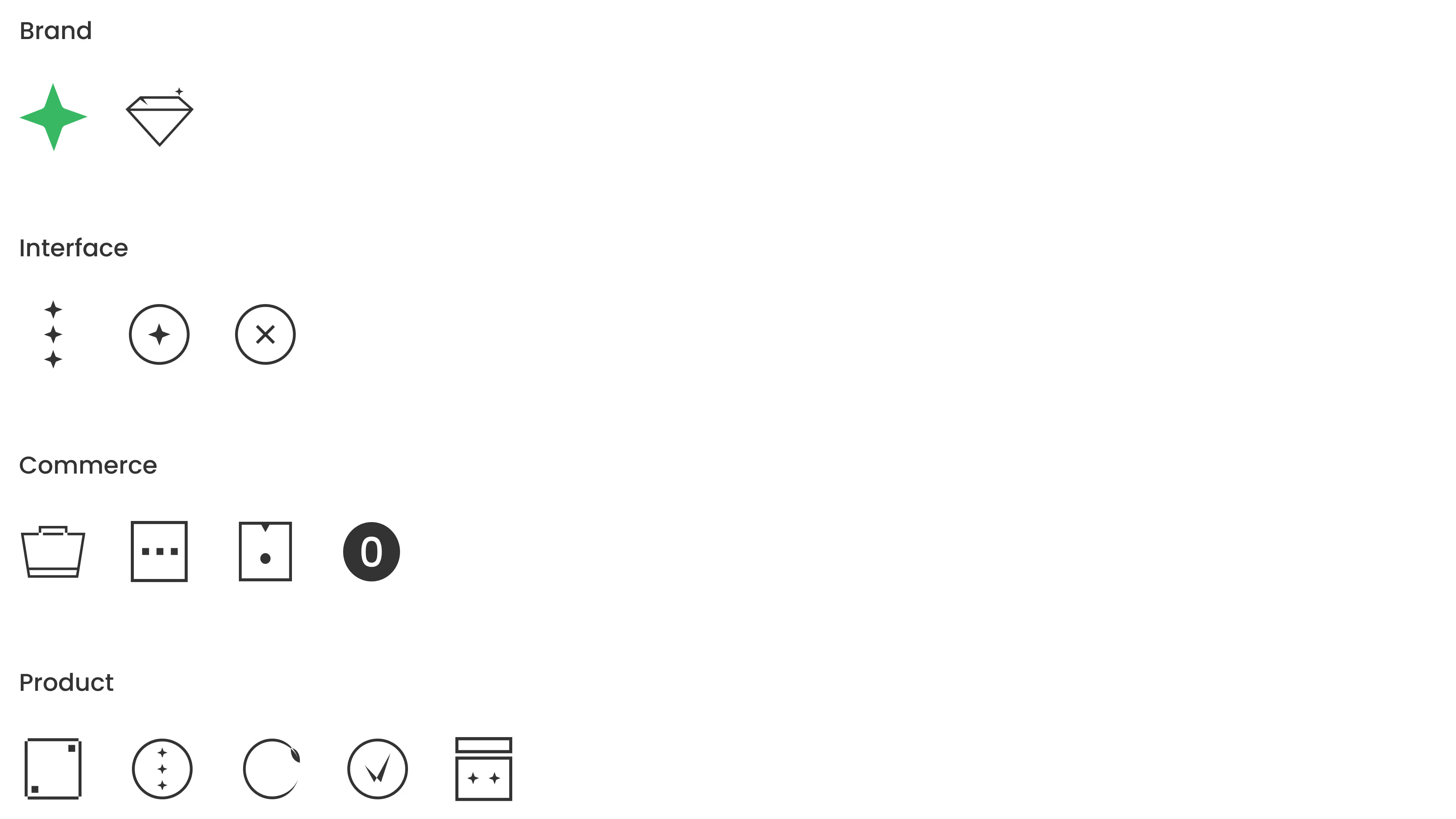
Iconography
Iconography creates a consistent visual system for brand moments, product details, commerce actions, and interface controls.
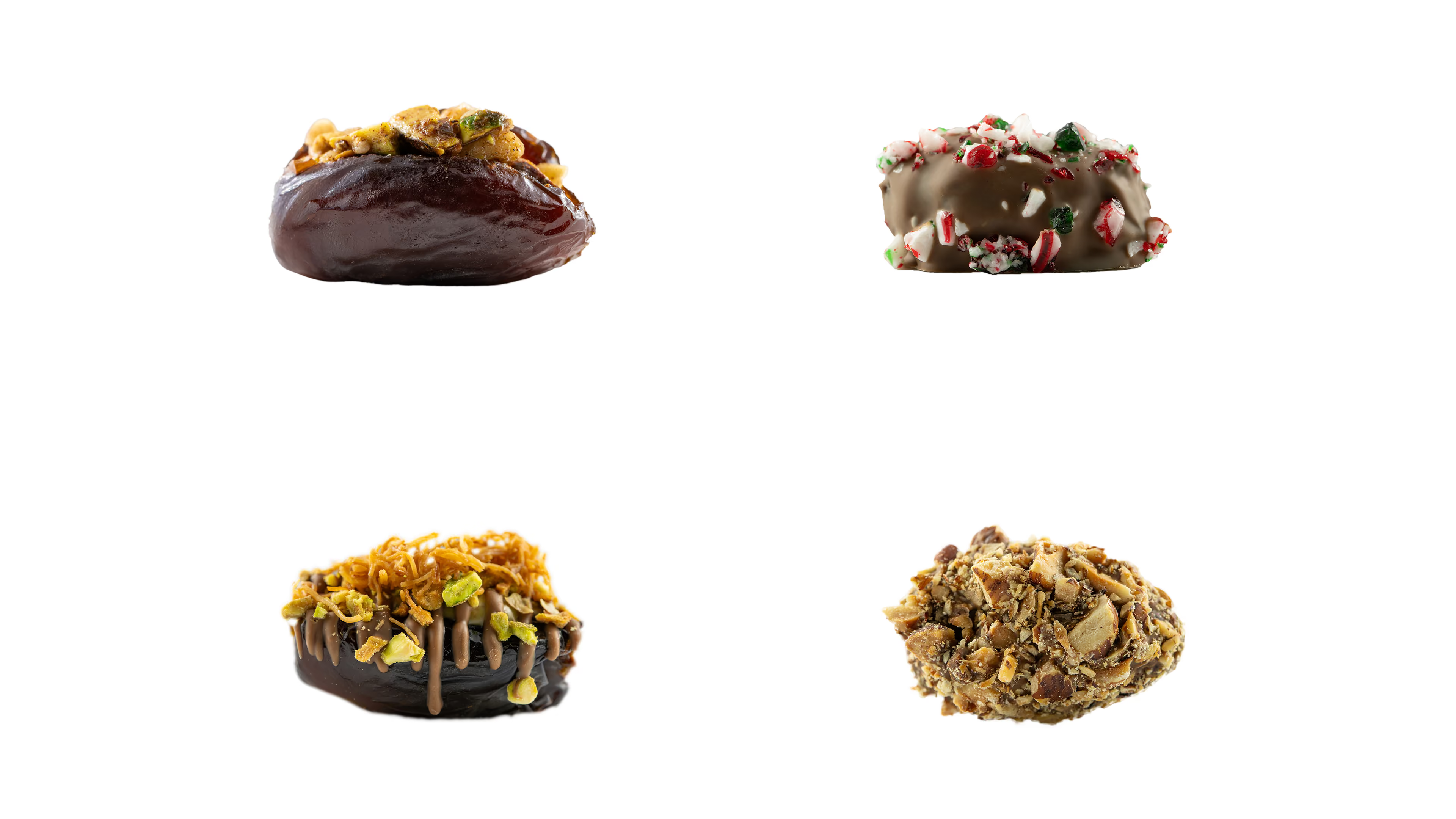
Photography
Photography defines the product experience through texture, detail, composition, and intentional presentation.
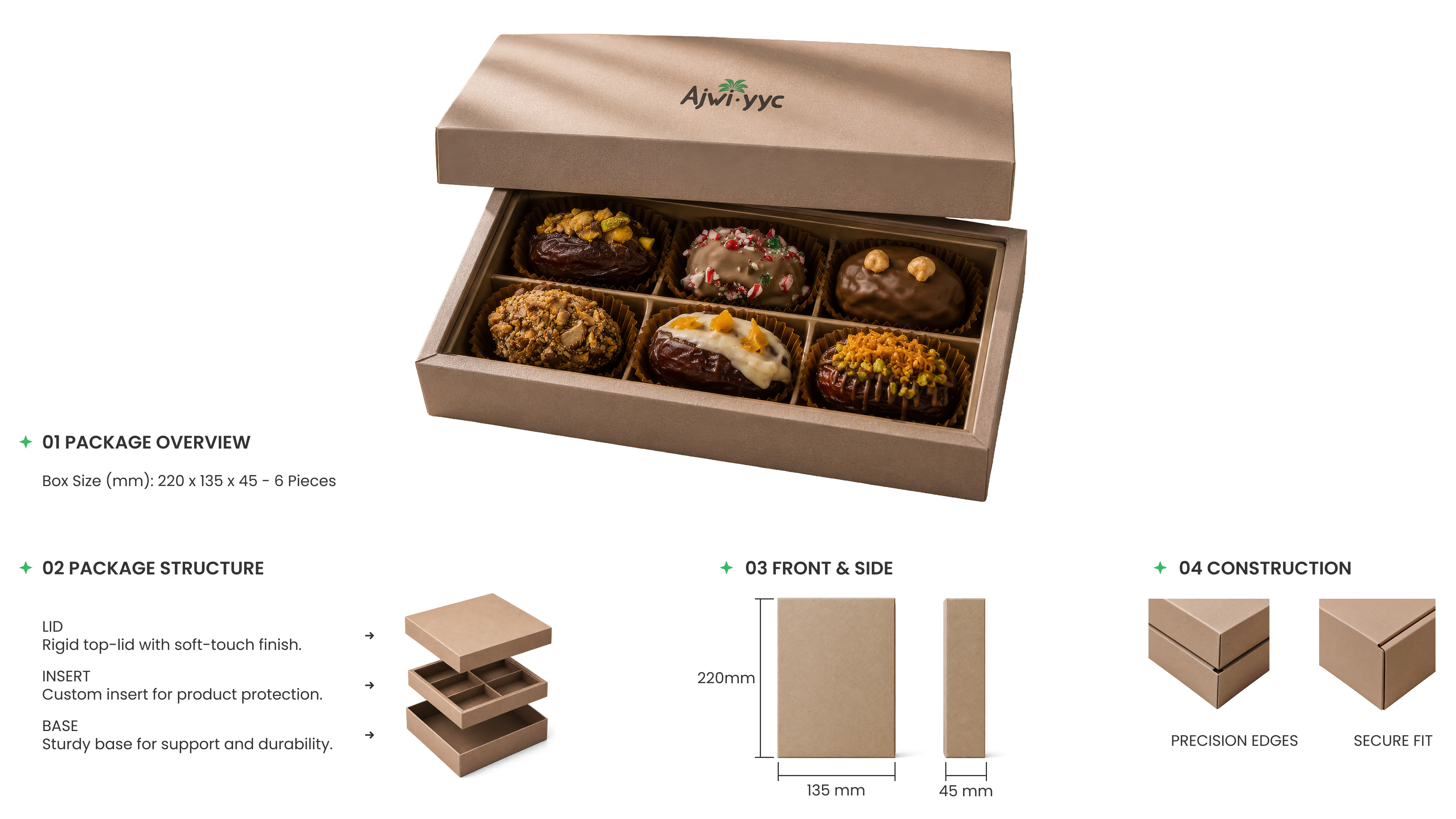
Packaging
Packaging translates Ajwi YYC into a physical experience through structure, restraint, and considered material details.
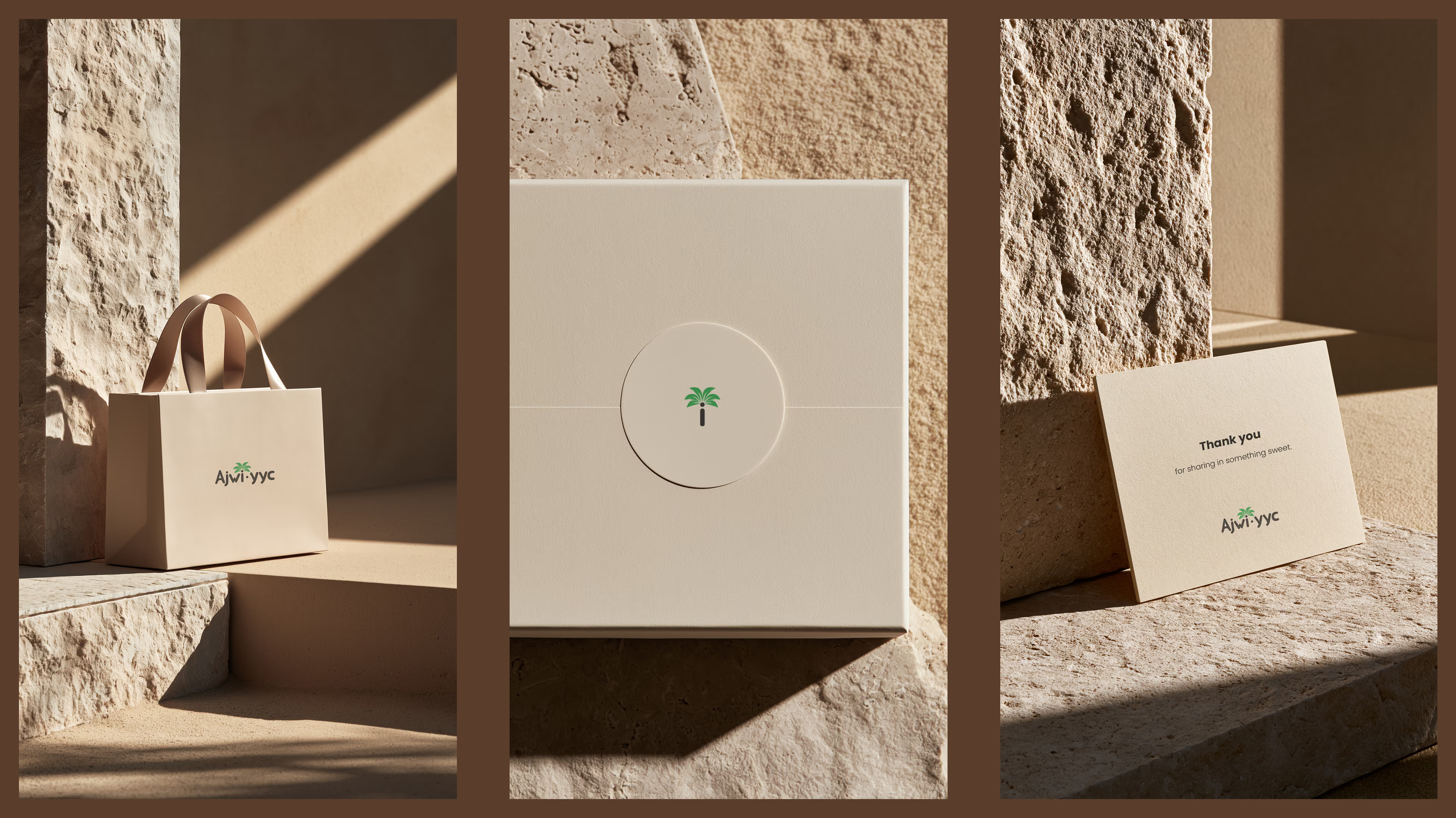
Applications
Across each application, the brand remains recognizable through disciplined use of scale, placement, and visual restraint.
Web Design
Tailored e-commerce design and development establish a refined digital storefront, guiding customers from product discovery to checkout through a clean, conversion-focused experience.
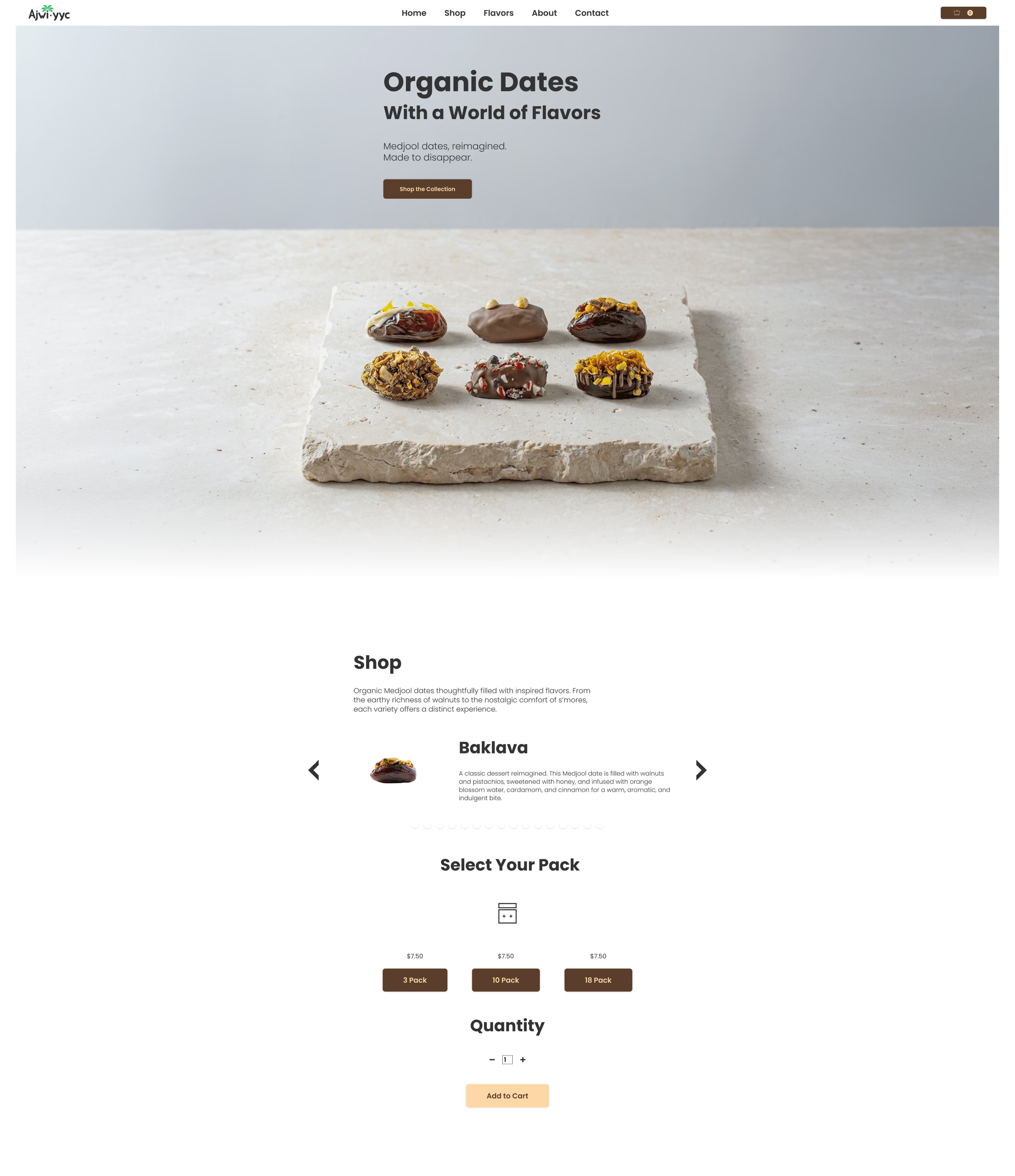
Responsive
Designed for both desktop and mobile, the interface adapts seamlessly across screen sizes while maintaining a consistent visual language and intuitive user experience.
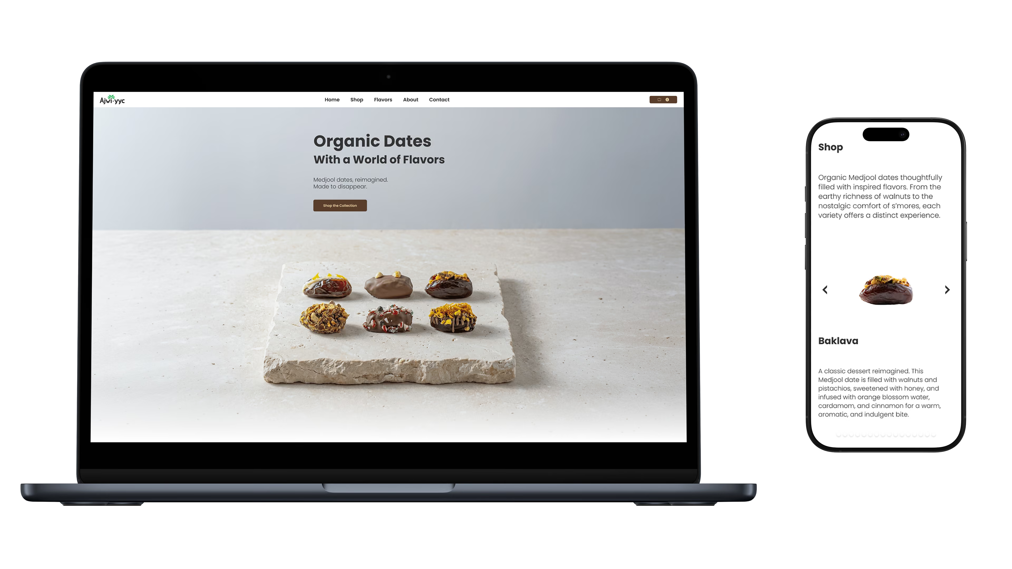
User Interface
The interface combines a custom flavor selector, branded menu animations, interactive product browsing, and a tailored carousel system to create a shopping experience that feels intuitive, responsive, and distinctly Ajwi YYC.
Art Direction
Art direction shapes Ajwi YYC’s visual world through warm stone, palm shadows, and tactile materials inspired by date palms.